Figuration libre
Free Figuration
Figurazione libera
L’expression a été inventée par l’artiste Ben Vautier en 1981.
Elle sert à identifier une génération d’artistes français nés au milieu des années 1960 et qui ont comme point commun un retour à la figuration. Tous rejettent l’art intellectuel, qui a régné durant les années 1970 (Art conceptuel et Minimalisme), et ont un goût pour la provocation et une forme de naïveté.
Alberola, Blais, Blanchard, Boisrond, Combas et Di Rosa intègrent à leur peinture colorée, qu’ils définissent comme amusante, sobre et décontractée, des éléments de la pop culture, du rock à la BD en passant par la science-fiction.
En décembre 1984, Blanchard, Boisrond, Combas et Di Rosa exposent et se confrontent aux américains Basquiat, Crash, Haring et Scharf au Musée d’art moderne de la Ville de Paris lors de l’exposition 5/5 : Figuration Libre, France-USA.
The expression was coined by the artist Ben in 1981.
It is used to identify a generation of French artists born in the mid-1960s who have in common a return to figuration. All of them reject the intellectual art, which reigned during the 1970s (Conceptual art and Minimalism), and have a taste for provocation and a form of naivety.
Alberola, Blais, Blanchard, Boisrond, Combas and Di Rosa integrate elements of pop culture, from rock to comics to science fiction, into their colorful paintings, which they define as fun, sober and relaxed.
In December 1984, Blanchard, Boisrond, Combas and Di Rosa exhibited and confronted the Americans Basquiat, Crash, Haring and Scharf at the Musée d’Art Moderne de la Ville de Paris during the exhibition « 5/5 : Figuration Libre, France-USA ».
L’espressione è stata coniata dall’artista Ben nel 1981.
È usato per identificare una generazione di artisti francesi nati a metà degli anni ’60 che hanno in comune il ritorno alla figurazione. Tutti rifiutano l’arte intellettuale che regnava negli anni ’70 (arte concettuale e minimalismo) e hanno un gusto per la provocazione e una forma di ingenuità.
Alberola, Blais, Blanchard, Boisrond, Combas e Di Rosa hanno integrato elementi della cultura pop, dal rock ai fumetti alla fantascienza, nei loro dipinti colorati, che hanno definito divertenti, sobri e rilassati.
Nel dicembre 1984, Blanchard, Boisrond, Combas e Di Rosa espongono e si confrontano con gli americani Basquiat, Crash, Haring e Scharf al Musée d’Art Moderne de la Ville de Paris durante la mostra 5/5 : Figuration Libre, France-USA.
AFFICHEPOSTERPOSTER
Feuille écrite ou imprimée placardée dans un lieu public et portant une annonce officielle, publicitaire ou propagandiste, à laquelle une image peut être associée. Les affiches constituent parfois la matière première d’œuvres contemporaines.
A written or printed sheet posted in a public place bearing an official, advertising or propaganda announcement, to which an image may be associated. Posters are sometimes the raw material for contemporary works.
Un foglio scritto o stampato affisso in un luogo pubblico che reca un annuncio ufficiale, pubblicitario o propagandistico, al quale può essere associata un’immagine. I manifesti sono a volte la materia prima per le opere contemporanee.
Histoire racontée par la succession d’images dessinées, où les paroles, pensées, sentiments, des personnages sont inscrits dans des bulles. La page contenant une partie de l’histoire se nomme une planche. Elle est généralement constituée d’une ou plusieurs bandes (lignes d’images). Chaque bande comporte une ou plusieurs vignettes ou cases (images). Dans les vignettes/cases, on retrouve : le dessin et les bulles. Les personnages parlent parfois sous formes d’onomatopées (mots ou des icônes suggérant un bruit, une action, une pensée).
A story told through a succession of drawn images, where the words, thoughts and feelings of the characters are written in speech bubbles. The page containing a part of the story is called a plate. It is generally made up of one or more strips (lines of images). Each strip has one or more thumbnails or boxes (pictures). In the vignettes/cases, there are : the drawing and the speech bubbles. The characters sometimes speak in the form of onomatopoeia (words or icons suggesting a noise, an action, a thought).
Una storia raccontata attraverso una successione di immagini disegnate, dove le parole, i pensieri, i sentimenti, dei personaggi sono scritti in bolle di discorso. La pagina che contiene una parte della storia è chiamata piatto. È generalmente composto da una o più strisce (linee di immagini). Ogni striscia ha una o più miniature o scatole (immagini). Nelle vignette/casi, troviamo : il disegno e le bolle di discorso. I personaggi a volte parlano sotto forma di onomatopee (parole o icone che suggeriscono un rumore, un’azione, un pensiero).
CARICATURECARICATURECARICATURA
Portrait (dessin, peinture, écriture, etc.) dont l’exagération et la déformation des traits caractéristiques du visage ou des proportions du corps, donnent un résultat humoristique dans une intention satirique.
Contour, ligne ou surface qui délimite une forme, qui permet de la définir, de la déterminer, de la préciser.
En art, on nomme « cerne » ou « cerne noir » un contour fortement marqué et visuellement mis en valeur par un tracé noir. Exemple : Le Fakir, d’Hervé Di Rosa
Portrait (drawing, painting, writing, etc.) in which the exaggeration and distortion of characteristic facial features or body proportions give a humorous result with satirical intent.
Ritratto (disegno, pittura, scrittura, ecc.) in cui l’esagerazione e la distorsione dei tratti caratteristici del viso o delle proporzioni del corpo, danno un risultato umoristico con intento satirico.
COULEURCOLOURCOLORE
Qualité de la lumière que renvoie un objet et qui permet à l’œil de le distinguer des autres objets, indépendamment de sa nature et de sa forme. En art, tons ou teintes utilisés par l’artiste dans une œuvre ; effet obtenu par leur combinaison.
The quality of light that an object reflects and that allows the eye to distinguish it from other objects, regardless of its nature and shape. In art, tones or hues used by the artist in a work ; the effect obtained by their combination.
La qualità della luce riflessa da un oggetto che permette all’occhio di distinguerlo da altri oggetti, indipendentemente dalla sua natura e forma. In arte, i toni o le tonalità usate dall’artista in un’opera ; l’effetto ottenuto dalla loro combinazione.
DIPTYQUEDIPTYQUEDIPTYQUE
Au Moyen Âge le diptyque est un ouvrage peint ou sculpté sur un support constitué de deux panneaux qui peuvent se rabattre l’un sur l’autre. Dans l’art contemporain le mot diptyque est aussi utilisé pour définir une œuvre composée de deux parties distinctes mais complémentaires.
In the Middle Ages, a diptych was a painted or sculpted work on a support consisting of two panels that could be folded over each other. In contemporary art the word diptych is also used to define a work composed of two distinct but complementary parts.
Nel Medioevo il dittico è un’opera dipinta o scolpita su un supporto composto da due pannelli che possono essere ripiegati uno sull’altro. Nell’arte contemporanea la parola dittico è anche usata per definire un’opera composta da due parti distinte ma complementari.
DISPROPORTIONDISPROPORTIONDISPROPORZIONE
Défaut de proportion, différence excessive, déséquilibre entre deux ou plusieurs choses ou personnes, ou entre les parties d’un même ensemble. En art, la disproportion peut être volontaire et contribuer à un effet ou un ressenti que veut transmettre l’artiste. A titre d’exemple : Jean-Charles Blais, artiste de la Figuration Libre représente dans son œuvre La Honte, d’énormes personnages à la tête miniature, elle est volontairement disproportionnée par rapport au reste du corps.
Defect of proportion, excessive difference, imbalance between two or more things or persons, or between parts of the same whole. In art, disproportion can be voluntary and contribute to an effect or a feeling that the artist wants to convey. For example : Jean-Charles Blais, an artist of the Figuration Libre movement, represents in his work La Honte, enormous characters with miniature heads, which are voluntarily disproportionate to the rest of the body.
Difetto di proporzione, differenza eccessiva, squilibrio tra due o più cose o persone, o tra parti di uno stesso insieme. Nell’arte, la sproporzione può essere volontaria e contribuire a un effetto o a una sensazione che l’artista vuole trasmettere. Come esempio : Jean-Charles Blais, artista della Figuration Libre rappresenta nella sua opera La Honte, enormi personaggi con teste in miniatura, è volontariamente sproporzionato al resto del corpo.
HUMOURHUMORHUMOR
Forme d’esprit qui consiste à souligner le caractère comique, ridicule, absurde ou insolite de certains aspects de la réalité.
L’humour est souvent employé chez les artistes pour aborder des sujets plus graves ou faire passer des messages.
A form of wit that consists of emphasizing the comical, ridiculous, absurd or unusual character of certain aspects of reality.
Humour is often used by artists to address more serious subjects or to convey messages.
Una forma di arguzia che consiste nel sottolineare il carattere comico, ridicolo, assurdo o insolito di certi aspetti della realtà.
L’umorismo è spesso impiegato dagli artisti per affrontare argomenti più seri o per trasmettere messaggi.
RELIEFRELIEFRELIEF
Ce qui fait saillie sur une surface. Le mot peut désigner également ce qui distingue du commun, de la banalité. Le mouvement Figuration Libre englobe souvent les deux sens du terme.
That which protrudes from a surface. The word can also refer to that which stands out from the common, the banal. The Figuration Libre movement often encompasses both meanings of the term.
Ciò che sporge da una superficie. La parola può anche riferirsi a ciò che si distingue dal comune, dal banale. Il movimento Figuration Libre spesso comprende entrambe le accezioni del termine.
ROCKROCKROCK
Genre musical inspiré du Rythm and Blues et de la country, apparu dans les années 1950 aux Etats-Unis et qui se développera en différents sous-genres à partir des années 1960 (Folk Rock, Blues Rock, Hard Rock, Heavy Metal, Punk Rock, Pop Rock, New Wave, Rock Alternatif etc…) .
A l’origine le rock est l’expression d’un courant populaire jeune, d’un milieu social économiquement faible ou moyen, souvent de pratique marginale. C’est en particulier cette idée de popularité et de singularité qui sera reprise par les œuvres des artistes du mouvement Figuration Libre.
Musical genre inspired by Rhythm and Blues and country music, which appeared in the 1950s in the United States and developed into different sub-genres from the 1960s onwards (Folk Rock, Blues Rock, Hard Rock, Heavy Metal, Punk Rock, Pop Rock, New Wave, Alternative Rock etc...).
Originally, rock was the expression of a young popular current, from a low or average social background, often of marginal practice. It is in particular this idea of popularity and singularity that will be taken up by the works of the artists of the Figuration Libre movement.
Genere musicale ispirato al Rhythm and Blues e alla musica country, apparso negli anni ’50 negli Stati Uniti e sviluppatosi in diversi sottogeneri a partire dagli anni ’60 (Folk Rock, Blues Rock, Hard Rock, Heavy Metal, Punk Rock, Pop Rock, New Wave, Alternative Rock etc...).
In origine, il rock è l’espressione di una corrente popolare giovane, di estrazione sociale bassa o media, spesso di pratica marginale. È in particolare questa idea di popolarità e singolarità che sarà ripresa dalle opere degli artisti del movimento Figuration Libre.
SCIENCEFICTIONSCIENCEFICTIONFANTASCIENZA
Genre littéraire et cinématographique qui décrit des événements ou des situations dans un avenir fictif construit sur l’extrapolation des données contemporaines de la science ou des techniques.
Literary and cinematographic genre that describes events or situations in a fictional future built on the extrapolation of contemporary scientific or technical data.
Un genere letterario e cinematografico che descrive eventi o situazioni in un futuro fittizio costruito sull’estrapolazione di dati scientifici o tecnici contemporanei.
SÉRIE B / Z
B / Z SERIESSERIE B / Z
La série B (B movie aux U.S.A) désignait au départ des films au petit budget de production dont la durée est inférieure à 1h30 et qui dans les années 30 étaient diffusés en plus du film à gros budget, permettant à certaines salles de cinéma de proposer deux films pour le prix d’un. La série b explore à sa manière de multiples genres cinématographiques notamment le western, l’horreur ou encore la science-fiction. Le terme série B est parfois employé de manière péjorative pour qualifier un mauvais film.
La série Z (Z movie aux U.S.A) désigne les films dont le budget de production est encore plus faible que celui des séries b. Le terme de série Z désigne un cinéma proche de l’amateurisme. Il peut être employé de manière péjorative pour qualifier un mauvais film de série B.
The B-movie in the U.S.A. originally referred to low-budget films with a running time of less than one and a half hours, which in the 1930s were shown in addition to the big-budget film, allowing some cinemas to offer two films for the price of one. The B-movie explores multiple film genres in its own way, including westerns, horror and science fiction. The term B-series is sometimes used pejoratively to describe a bad film.
The term Z series (Z movie in the U.S.A.) refers to films whose production budget is even lower than that of B series. The term Z series refers to cinema that is close to amateurism. It can be used pejoratively to describe a bad B movie.
La serie B (B movie negli Stati Uniti) designava inizialmente i film di produzione a basso costo la cui durata è inferiore a 1h30 e che negli anni ’30 venivano proiettati in aggiunta al film a grande budget, permettendo a certe sale di offrire due film al prezzo di uno. Il B-movie esplora a modo suo molteplici generi cinematografici tra cui il western, l’horror e la fantascienza. Il termine B-movie è talvolta usato in modo peggiorativo per descrivere un brutto film.
La serie Z (Z movie negli Stati Uniti) designa i film il cui budget di produzione è ancora inferiore a quello della serie B. Il termine serie Z designa un cinema vicino al dilettantismo. Può essere usato in modo peggiorativo per descrivere un brutto film di serie B.
TRIPTYQUETRIPTYPETRIPTYCH
Dans le domaine de l’art, le triptyque est une œuvre peinte ou sculptée en trois panneaux, dont les deux volets extérieurs peuvent se refermer sur celui du milieu. Dans l’art contemporain le mot triptyque est aussi utilisé pour définir une œuvre composée de trois parties distinctes mais complémentaires
In art, a triptych is a painted or sculpted work in three panels, the two outer panels of which can close over the middle one. In contemporary art the word triptych is also used to define a work composed of three distinct but complementary parts
In arte, un trittico è un’opera dipinta o scolpita in tre pannelli, i due esterni dei quali possono chiudersi sopra quello centrale. Nell’arte contemporanea la parola trittico è anche usata per definire un’opera composta da tre parti distinte ma complementari
Jean-Michel Alberola
Saïda 1953
D’origine algérienne, Alberola se forme à l’école des beaux-arts de Marseille. Depuis le début des années 1980, il réunit dans son œuvre figuration et abstraction. En 1981, il participe, avec d’autres artistes tels que Robert Combas et Jean-Charles Blais, à l’exposition « Finir en beauté » à Paris. Il devient alors l’un des représentants de la Figuration Libre. L’œuvre d’Alberola associe des références intellectuelles tirées de l’histoire de l’art à des éléments proches de la culture populaire et de la bande dessinée. Il travaille notamment à partir de thèmes classiques, d’origine biblique (Suzanne et les Vieillards) ou mythologique (Diane et Actéon). Grâce à ces personnages emblématiques, il construit sa réflexion autour de l’importance du regard voyeur. Alberola s’identifie même à travers la figure d’Actéon (chasseur qui surprend Diane se baignant nue) et signe ses œuvres par « Acteon pinxit » ou « Acteon fecit ».
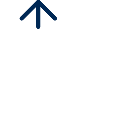
La nuit de Suzanne, 1982
Dyptique Huile sur toile 324 x 130 cm (l’ensemble) Achat, 1983
Inv. 983.3.25.1-2
Une part importante du travail d’Alberola s’élabore au début des années 1980 à partir d’une iconographie d’origine biblique ou mythologique, et se caractérise par l’abondance des morceaux choisis dans les œuvres de maîtres classiques.
La nuit de Suzanne est un dyptique inspiré du tableau de Tintoret (1519-1594), Suzanne et les vieillards, qui fait référence à un texte religieux du même nom. Le mécanisme de la vision est ainsi mis en valeur à travers l’histoire de ces vieillards regardant, à son insu, la jeune Suzanne dans son bain.
Jean-Michel Alberola
Saïda 1953
Of Algerian origin, Alberola trained at the School of Fine Arts in Marseille. Since the beginning of the 1980s, he has combined figuration and abstraction in his work. In 1981, he participates, with other artists such as Robert Combas and Jean-Charles Blais, in the exhibition “Finir en beauté” in Paris. He then became one of the representatives of the Figuration Libre. Alberola’s work combines intellectual references drawn from art history with elements close to popular culture and the comic strip. He works in particular from classical themes, of biblical origin (Susanna and the Old Men) or mythological (Diana and Actaeon). Thanks to these emblematic characters, he builds his reflection around the importance of the voyeuristic look. Alberola even identifies himself through the figure of Actaeon (a hunter who surprises Diana bathing naked) and signs his works with “Acteon pinxit” or “Acteon fecit”.
La nuit de Suzanne, 1982
Dyptic Oil on canvas 324 x 130 cm (the whole) Purchase, 1983
Inv. 983.3.25.1-2
An important part of Alberola’s work was developed in the early 1980s from iconography of biblical or mythological origin, and is characterised by the abundance of pieces chosen from the works of classical masters.
Susanna’s Night is a dyptic inspired by Tintoretto’s (1519-1594) painting, Susanna and the Elders, which refers to a religious text of the same name. The mechanism of vision is thus emphasised through the story of the old men watching, unbeknownst to him, the young Susanna in her bath.
Jean-Michel Alberola
Saïda 1953
Di origine algerina, Alberola ha studiato alla Scuola di Belle Arti di Marsiglia. Dall’inizio degli anni ’80, ha combinato figurazione e astrazione nel suo lavoro. Nel 1981, ha partecipato, con altri artisti come Robert Combas e Jean-Charles Blais, alla mostra «Finir en beauté» a Parigi. Divenne poi uno dei rappresentanti della Figuration Libre. Il lavoro di Alberola combina riferimenti intellettuali tratti dalla storia dell’arte con elementi vicini alla cultura popolare e al fumetto. In particolare, lavora su temi classici, di origine biblica (Susanna e i vecchi) o mitologica (Diana e Atteone). Grazie a questi personaggi emblematici, costruisce la sua riflessione sull’importanza dello sguardo voyeuristico. Alberola si identifica addirittura con la figura di Atteone (un cacciatore che sorprende Diana che fa il bagno nuda) e firma le sue opere con «Acteon pinxit» o «Acteon fecit».
La nuit de Suzanne, 1982
Dittico Olio su tela 324 x 130 cm (il tutto) Acquisto, 1983
Inv. 983.3.25.1-2
Una parte importante del lavoro di Alberola è stata sviluppata nei primi anni ’80 a partire dall’iconografia di origine biblica o mitologica, ed è stata caratterizzata dall’abbondanza di pezzi scelti dalle opere dei maestri classici.
La notte di Susanna è un dyptic ispirato al dipinto di Tintoretto (1519-1594), Susanna e gli anziani, che si riferisce a un testo religioso con lo stesso nome. Il meccanismo della visione è così sottolineato attraverso la storia di questi vecchi che guardano, a sua insaputa, la giovane Susanna nel suo bagno.
Jean-Charles Blais
Nantes 1956
Jean-Charles Blais étudie à l’école des beaux-arts de Rennes de 1974 à 1979. En 1981, il intègre le mouvement de la figuration libre en participant à l’exposition Finir en beauté à Paris.
Dès le début des années 80, il est connu pour l’utilisation d’affiches lacérées qu’il récupère dans l’espace urbain dont il se sert comme support pour ses peintures et dessins. Au revers, il y peint des personnages aux membres disproportionnés et à la tête quasi-inexistante. Rapidement, ses figures évoluent et prennent la forme de silhouettes noires.
Au cours de sa carrière, Blais explore différentes formes d’expression, passant de la figuration à l’abstraction jusqu’à la dématérialisation de ses créations. Depuis les années 2000, il étend davantage sa pratique en s’exprimant à travers le numérique.
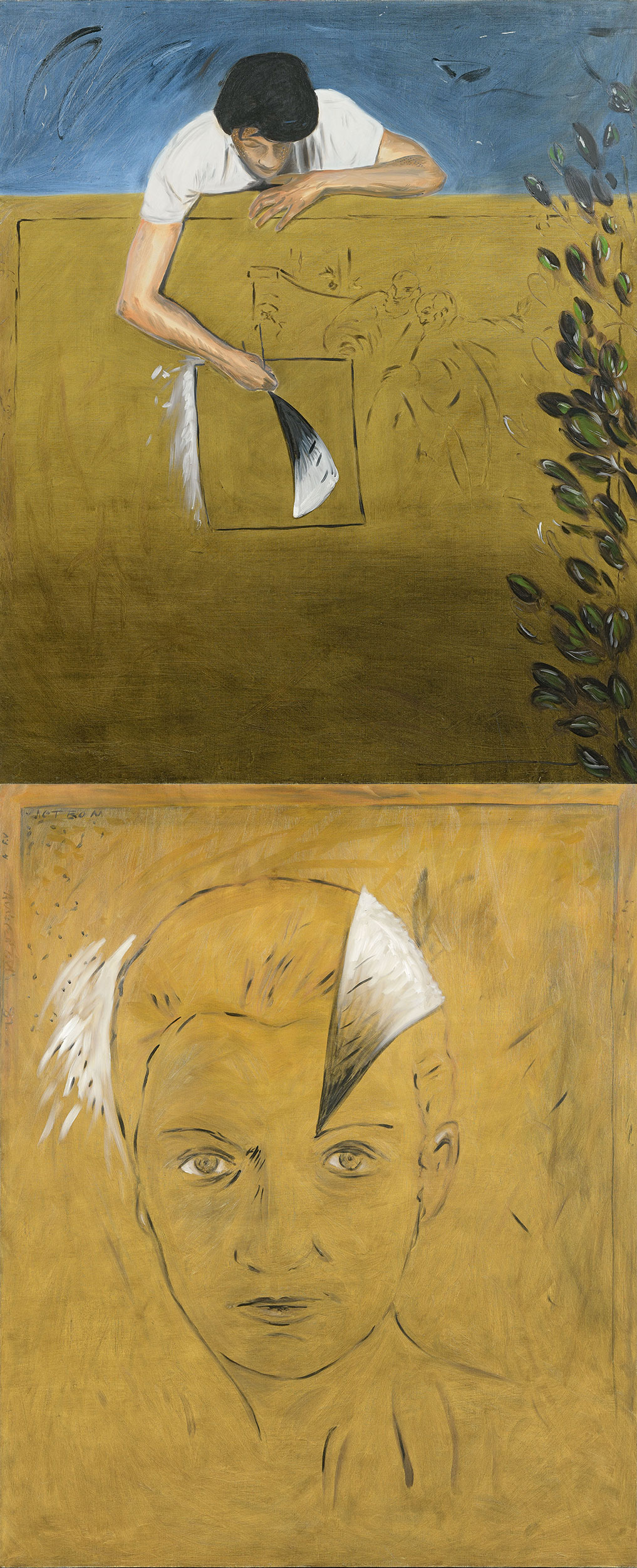
La Honte, 1983
Diptyque Huile et craie sur couches d’affiches arrachées 278 x 192 cm (chaque élément) Achat avec l’aide du FRAM, 1984
Inv. 985.2.53.1-2
Jean-Charles Blais fait de la peinture, mais en la désacralisant. Il troque la traditionnelle toile blanche contre des supports qu’il déniche dans la rue.
Durant les années 1980, il développe une peinture colorée sur des entassements d’affiches où les corps anonymes aux membres disproportionnés sont omniprésents.
Dans La Honte, les personnages imposants dominent les spectateurs. Ils sont au premier plan, sous le feu des projecteurs dans un espace rappelant une scène de théâtre. Les gestes et postures paraissent caricaturales et les visages sont cachés ou absents. Des caractéristiques que l’on retrouve dans ses productions des années 1980.
L’artiste utilise les codes de la BD : les contours des personnages sont accentués par les traits réalisés à la brosse, le mouvement des danseurs est signifié par un idéogramme, le dessin des projecteurs est simplifié.
Jean-Charles Blais
Nantes 1956
Jean-Charles Blais studied at the School of Fine Arts in Rennes from 1974 to 1979. In 1981, he joined the free figuration movement by participating in the exhibition “Finir en beauté” in Paris.
Since the beginning of the 80s, he is known for the use of torn posters that he recovers in the urban space which he uses as a support for his paintings and drawings. On the reverse side, he paints characters with disproportionate limbs and almost non-existent heads. Quickly, his figures evolve and take the form of black silhouettes.
During his career, Blais explores different forms of expression, passing from figuration to abstraction until the dematerialization of his creations. Since the 2000s, he has further expanded his practice by expressing himself through digital media.
La Honte, 1983
Diptych Oil and chalk on layers of torn posters 278 x 192 cm (each element) Purchased with the help of FRAM, 1984
Inv. 985.2.53.1-2
Jean-Charles Blais does painting, but by desacralizing it. He swaps the traditional white canvas for supports that he finds in the street.
During the 1980s, he developed a coloured painting on piles of posters where anonymous bodies with disproportionate limbs are omnipresent.
In Shame, the imposing figures dominate the viewers. They are in the foreground, under the spotlight in a space reminiscent of a theatre stage. Gestures and postures appear caricatural and faces are hidden or absent. These characteristics can be found in his productions of the 1980s.
The artist uses the codes of the comic strip: the contours of the characters are accentuated by brush strokes, the movement of the dancers is signified by an ideogram, the drawing of the projectors is simplified.
Jean-Charles Blais
Nantes 1956
Jean-Charles Blais ha studiato alla Scuola di Belle Arti di Rennes dal 1974 al 1979. Nel 1981, si unisce al movimento della figurazione libera partecipando alla mostra «Finir en beauté» a Parigi.
Dall’inizio degli anni ’80, è noto per l’uso di manifesti strappati che recupera nello spazio urbano e che usa come supporto per i suoi dipinti e disegni. Sul rovescio, dipinge personaggi con arti sproporzionati e teste quasi inesistenti. Le sue figure si sono rapidamente evolute in sagome nere.
Nel corso della sua carriera, Blais esplora diverse forme di espressione, passando dalla figurazione all’astrazione fino alla smaterializzazione delle sue creazioni. Dagli anni 2000, ha ulteriormente ampliato la sua pratica esprimendosi attraverso i media digitali.
La Honte, 1983
Dittico Olio e gesso su strati di poster strappati 278 x 192 cm (ogni elemento) Acquistato con l’aiuto del FRAM, 1984
Inv. 985.2.53.1-2
Jean-Charles Blais fa la pittura, ma desacralizzandola. Scambia la tradizionale tela bianca con dei supporti che trova per strada.
Durante gli anni 80, ha sviluppato una pittura colorata su pile di manifesti dove corpi anonimi con arti sproporzionati sono onnipresenti.
In Shame, le figure imponenti dominano gli spettatori. Sono in primo piano, sotto i riflettori in uno spazio che ricorda il palcoscenico di un teatro. I gesti e le posture appaiono caricatura e i volti sono nascosti o assenti. Queste caratteristiche si ritrovano nelle sue produzioni degli anni ’80.
L’artista utilizza i codici del fumetto: i contorni dei personaggi sono accentuati dalle linee fatte con un pennello, il movimento dei ballerini è significato da un ideogramma, il disegno dei proiettori è semplificato.
Rémi Blanchard
Nantes 1958 - Paris 1993
Après des études de mécanique, Rémi Blanchard s’inscrit aux beaux-arts de Quimper. Co-fondateur et membre actif de la Figuration Libre, l’œuvre de Blanchard est influencée par Van Gogh, Léger, Matisse ou Chaissac. La première image de sa peinture est celle du cerf. Rémi Blanchard aime les animaux qu’il n’a cessé de représenter : renard, loup, aigle, vautour etc.
Les couleurs intenses, la touche large et rapide, la fougue dans l’exécution, composant nombre de tableaux du début des années quatre-vingt, laissent peu à peu place à la douceur de la courbe, à la tendresse du sujet, à la nostalgie de son enfance : camping, caravane, vie de bohème…
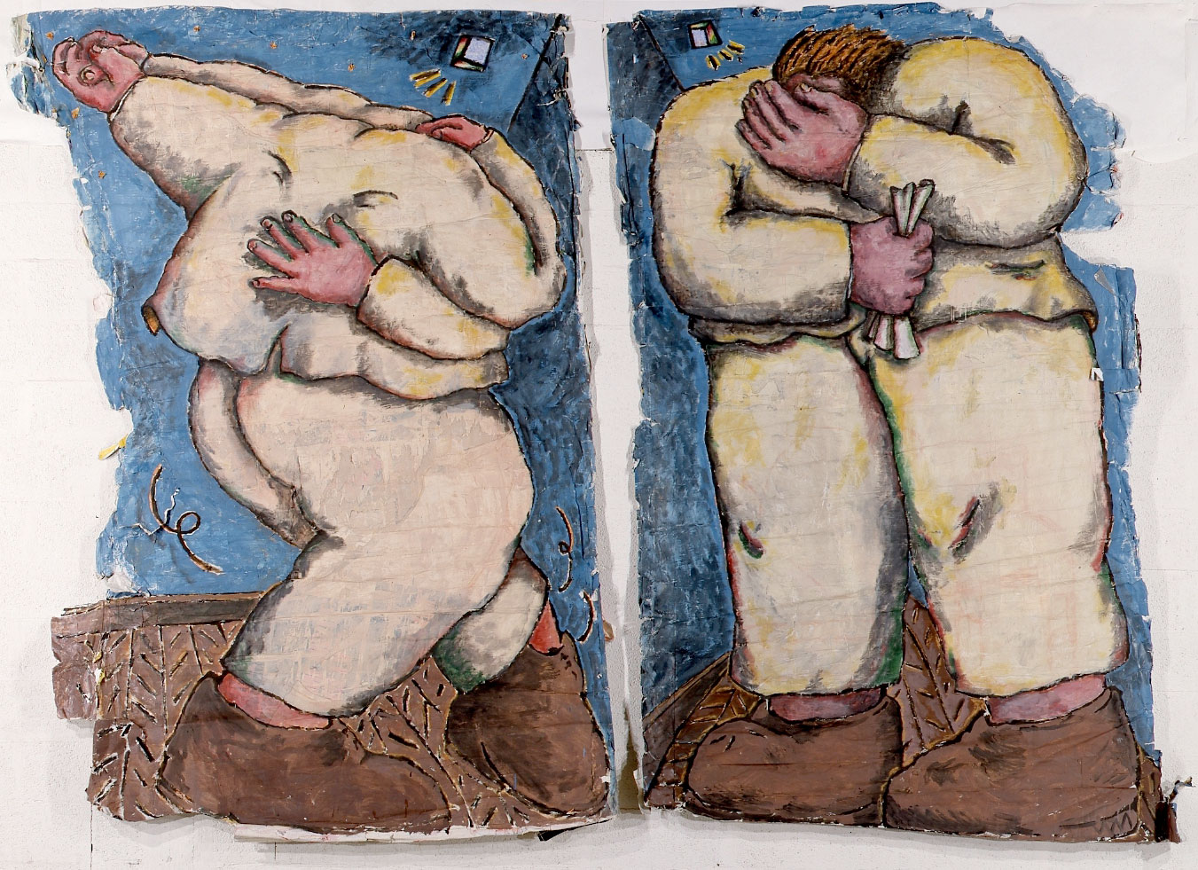
Ramage, 1982
Acrylique sur toile, plumes et bois 182 x 154 cm Achat avec l’aide du FRAM, 1982
Inv. 982.6.105
Au premier plan, le corbeau, majestueux, et le renard aux couleurs flamboyantes s’animent autour d’un personnage dont on distingue les traits qui se fondent avec les tons plus sombres du deuxième plan.
Les couleurs vives et éclatantes débordent sur le cadre et témoignent de la rapidité du geste et du plaisir de peindre sans limite.
Les plumes collées, souvent utilisées chez Rémi Blanchard, donnent du relief à l’œuvre. Cette pratique gestuelle sera rapidement abandonnée par l’artiste, agacé par la critique qui le compare alors au graffitiste américain J. Schnabel.
Rémi Blanchard
Nantes 1958 - Paris 1993
After studying mechanics, Blanchard enrolled in the fine arts school in Quimper. Co-founder and active member of the Figuration Libre, Blanchard’s work is influenced by Van Gogh, Léger, Matisse and Chaissac. The first image of his painting is that of the deer. Rémi Blanchard loves animals that he has never stopped representing: fox, wolf, eagle, vulture etc.
The intense colors, the broad and fast touch, the ardor in the execution, composing a number of paintings of the early eighties, gradually give way to the softness of the curve, the tenderness of the subject, the nostalgia of his childhood: camping, caravan, bohemian life...
Ramage, 1982
Acrylic on canvas, feathers and wood 182 x 154 cm Purchased with the help of the FRAM, 1982
Inv. 982.6.105
In the foreground, the raven, majestic, and the fox with flamboyant colours come to life around a character whose features can be seen blending with the darker tones of the second plane.
The bright and vivid colours overflow the frame and show the speed of the gesture and the pleasure of painting without limit.
The glued feathers, often used in Blanchard’s work, give the work relief. This gestural practice was quickly abandoned by the artist, annoyed by the critics who compared him to the American graffiti artist J. Schnabel.
Rémi Blanchard
Nantes 1958 - Parigi 1993
Dopo aver studiato meccanica, Blanchard si è iscritto alla scuola di belle arti di Quimper. Co-fondatore e membro attivo della Figuration Libre, il lavoro di Blanchard è influenzato da Van Gogh, Léger, Matisse e Chaissac. La prima immagine del suo dipinto è quella del cervo. Rémi Blanchard ama gli animali che non ha mai smesso di rappresentare: volpe, lupo, aquila, avvoltoio ecc.
I colori intensi, le pennellate larghe e rapide, l’ardore nell’esecuzione, che compongono un certo numero di quadri dall’inizio degli anni ottanta, lasciano gradualmente il posto alla morbidezza della curva, alla tenerezza del soggetto, alla nostalgia della sua infanzia: campeggio, roulotte, vita bohémien...
Ramage, 1982
Acrilico su tela, piume e legno 182 x 154 cm Acquistato con l’aiuto del FRAM, 1982
Inv. 982.6.105
In primo piano, il corvo, maestoso, e la volpe con colori fiammeggianti prendono vita intorno a un personaggio i cui tratti si vedono fondersi con i toni più scuri del secondo piano.
I colori brillanti e vividi colori traboccano dalla cornice e mostrano la velocità del gesto e il piacere di dipingere senza limiti.
Le piume incollate, spesso utilizzate nel lavoro di Blanchard, danno rilievo al lavoro. Questa pratica gestuale fu rapidamente abbandonata dall’artista, infastidito dai critici che lo paragonavano al graffitaro americano J. Schnabel.
Robert Combas
Lyon 1957
Durant son enfance passée à Sète, Robert Combas se lie d’amitié avec les frères Di Rosa. Après ses études aux beaux-arts de Montpellier, il s’installe en 1980 en région parisienne. Il expose en 1981 avec Boisrond, Blanchard, Di Rosa, qui forment avec lui la Figuration Libre.
Combas puise son inspiration dans les caricatures, les dessins d’enfants, la BD, les livres scolaires, le rock. Il applique sur sa toile des couleurs violentes cernées de noir, la recouvre totalement de signes ou de fausses écritures. À la fin des années 80 il développe un nouveau style en faisant émerger du fond noir de la toile des éléments de couleur qui rappellent les vitraux médiévaux. Puis il expérimente différents modes d’expression tels que la performance, la musique, mais aussi la sculpture, les tableaux-relief ou encore les habits peints.
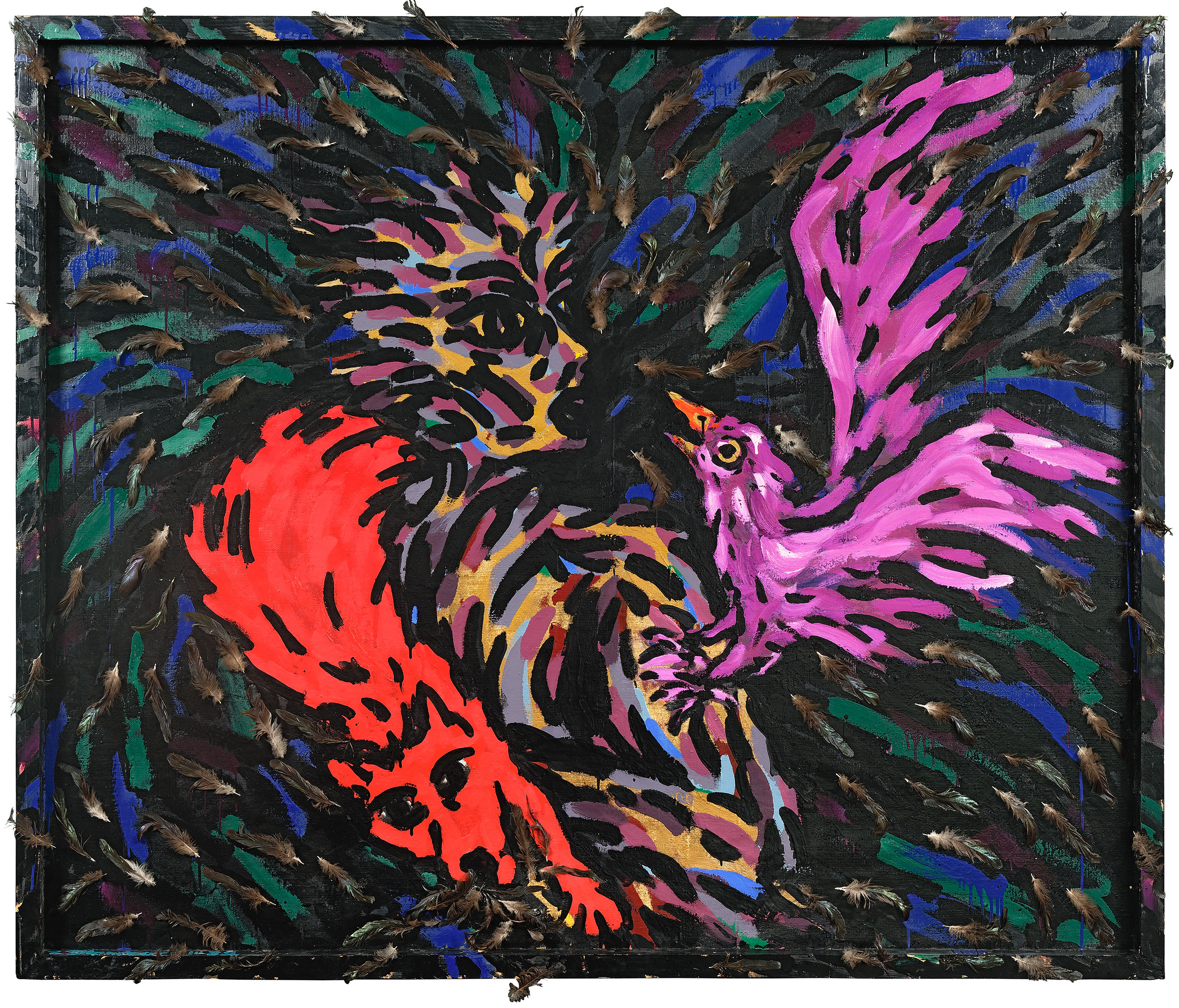
Le Fakir, 1982
Acrylique sur toile
_187 x 89 cm Don Nahon, 1982
Inv. 982.6.86
Le fakir est un personnage important dans la culture populaire des années 1950-1960. A l’époque, on retrouve cette figure décalée, presque caricaturale, dans des sketchs et des BD telle que Tintin. Musicien, chanteur, conteur, adepte de la transe, le fakir est un individu important dans la culture musulmane.
Le personnage est intégré de manière très frontale dans un espace coloré délimité d’un contour noir, comme à l’intérieur d’une case. On retrouve également le cerne noir et l’écriture, si chers à l’artiste.
La signature de Robert Combas de chaque côté de l’œuvre, ainsi que les sortes d’idéogrammes inventés par l’artiste évoquent une forme de cartouche égyptien
Robert Combas
Lyon 1957
During his childhood spent in Sète, Robert Combas befriended the brothers Di Rosa. After his studies at the fine arts school in Montpellier, he moved to the Paris region in 1980. He exhibited in 1981 with Boisrond, Blanchard, Di Rosa,} who formed with him the Figuration Libre.
Combas draws his inspiration from caricatures, children’s drawings, comics, school books, rock.} He applies on his canvas colors violent surrounded by black, covers it completely with signs or false writing. At the end of the 80’s he developed a new style by making elements of color emerge from the black background of the canvas, reminiscent of medieval stained glass. He then experimented with different modes of expression such as performance, music, but also sculpture, paintings and painted clothes.
Le Fakir, 1982
Acrylic on canvas 187 x 89 cm Gift from Nahon, 1982
Inv. 982.6.86
The fakir is an important character in the popular culture of the 1950s-1960s. At the time, this quirky, almost caricatured figure could be found in sketches and comics such as Tintin. Musician, singer, storyteller, adept at trance, the fakir is an important individual in Muslim culture.
The character is integrated in a very frontal way in a coloured space delimited by a black contour, as inside a box. We also find the black outline and the writing, so dear to the artist.
The signature of Robert Combas on each side of the work, as well as the sorts of ideograms invented by the artist, evoke a form of Egyptian cartouche
Robert Combas
Lyon 1957
Durante la sua infanzia trascorsa a Sète, Robert Combas fa amicizia con i fratelli Di Rosa. Dopo gli studi alla scuola di belle arti di Montpellier, si trasferisce nella regione di Parigi nel 1980. Espone nel 1981 con Boisrond, Blanchard, Di Rosa, che formano con lui la Figuration Libre.
Combas si ispira a caricature, disegni di bambini, fumetti, libri di scuola, rock. applica sulla sua tela violenti colori circondati dal nero, coprendola completamente con segni o scritte false. Alla fine degli anni ’80 ha sviluppato un nuovo stile facendo emergere elementi di colore dal fondo nero della tela, ricordando le vetrate medievali. Sperimentò poi diversi modi di espressione come la performance, la musica, ma anche la scultura, i tableaux-reliefs e gli abiti dipinti.
Le Fakir, 1982
Acrilico su tela 187 x 89 cm donato da Nahon, 1982
Inv. 982.6.86
Il fachiro è un personaggio importante nella cultura popolare degli anni 1950-1960. All’epoca, questa figura eccentrica, quasi caricaturale, si poteva trovare in schizzi e fumetti come Tintin. Musicista, cantante, narratore, esperto di trance, il fachiro è un individuo importante nella cultura musulmana.
Il personaggio è integrato in modo molto frontale in uno spazio colorato delimitato da un contorno nero, come dentro una scatola. Troviamo anche il contorno nero e la scritta, tanto cari all’artista.
La firma di Robert Combas su ogni lato dell’opera, così come i tipi di ideogrammi inventati dall’artista evocano una forma di cartiglio egiziano
Hervé Di Rosa
Sète 1959
Di Rosa dessine dès son enfance. En 1978, il entre à l’École nationale supérieure des arts décoratifs. En 1981, il expose avec d’autres jeunes artistes dont son ami Robert Combas, Rémi Blanchard et François Boisrond. Ils formeront ensemble la Figuration Libre.
Il revendique son goût pour la bande-dessinée, le rock, les films de série B et série Z ainsi que pour la Science-Fiction. Il peint dans des couleurs vives un monde qui fourmille de héros et superhéros récurrents, une mythologie personnelle pleine de vitalité, de violence, d’angoisse et d’humour.
En 1985, ses thèmes se diversifient, ses formes se simplifient. A partir de 1992, il voyage dans de nombreux pays et expérimente les techniques traditionnelles de peintures locales.
Il est le concepteur du Musée International de l’Art Modeste (MIAM) à Sète ouvert en 2000
Cosmos, 1982
Acrylique et craie grasse sur carton 123 x 83 cm Achat avec l’aide du FRAM, 1982
Inv. 982.5.71
Cette peinture d’Hervé Di Rosa réalisée sur du carton en 1982 nous fait voyager dans le cosmos.
Les multiples traits colorés autour des personnages, le traitement pictural du feu et de la planète bleue, accentuent l’impression de mouvement.
Les expressions des personnages ajoutent une pointe d’humour à l’ensemble. Hervé Di Rosa puise son inspiration dans l’imaginaire de Science-Fiction développé aux USA dans les années 1940-1960 à travers des romans, la bande dessinée et le cinéma série B et série Z. Cette œuvre n’est pas sans rappeler l’univers de Flash Gordon et de Guy l’éclair dans sa parution française
Hervé Di Rosa
Sète 1959
Di Rosa has been drawing since his childhood. In 1978, he entered the École nationale supérieure des arts décoratifs. In 1981, he exhibited with other young artists including his friend Robert Combas, Rémi Blanchard and François Boisrond. They formed together the Figuration Libre.
He claims his taste for the comic strip, the rock, the films of series B and series Z as well as for the Science-Fiction. He paints in bright colors a world teeming with recurring heroes and superheroes, a personal mythology full of vitality, violence, anguish and humor.
In 1985, his themes diversified, his forms became more flexible. From 1992, he traveled to many countries and experimented with traditional local painting techniques.
He is the designer of the International Museum of Modest Art (MIAM) in Sète, opened in 2000.
Cosmos, 1982
Acrylic and chalk on cardboard 123 x 83 cm Purchased with the help of FRAM, 1982
Inv. 982.5.71
This painting by Hervé Di Rosa made on cardboard in 1982 takes us on a journey into the cosmos.
The multiple coloured lines around the characters, the pictorial treatment of the fire and the blue planet, accentuate the impression of movement.
The expressions of the characters add a touch of humour to the whole. Hervé Di Rosa draws his inspiration from the Science-Fiction imaginary developed in the USA in the 1940s and 1960s through novels, comics and film B-series and Z-series. This work is reminiscent of the universe of Flash Gordon and Guy l’éclair in its French version
Hervé Di Rosa
Sète 1959
Di Rosa disegna sin dalla sua infanzia. Nel 1978, entra all’École nationale supérieure des arts décoratifs. Nel 1981, espone con altri giovani artisti tra cui il suo amico Robert Combas, Rémi Blanchard e François Boisrond. Formano la Figuration Libre.
Dichiara il suo gusto per i fumetti, rock, film di serie B e di serie Z così come per la Fantascienza. Dipinge con colori brillanti un mondo brulicante di eroi e supereroi ricorrenti, una mitologia personale piena di vitalità, violenza, angoscia e humor.
Nel 1985, i suoi temi si diversificano, le sue forme diventano più varie e dal 1992 in poi, viaggia in molti paesi e sperimenta le tecniche pittoriche tradizionali locali.
È il progettista del Museo Internazionale d’Arte Modesta (MIAM) di Sète, aperto nel 2000.
Cosmos, 1982
Acrilico e gesso su cartone 123 x 83 cm Acquistato con l’aiuto del FRAM, 1982
Inv. 982.5.71
Questo dipinto di Hervé Di Rosa realizzato su cartone nel 1982 ci porta in un viaggio nel cosmo.
Le molteplici linee colorate intorno ai personaggi, il trattamento pittorico del fuoco e del pianeta blu, accentuano l’impressione di movimento.
Le espressioni dei personaggi aggiungono un tocco di umorismo al tutto. Hervé Di Rosa si ispira all’immaginario Science-Fiction sviluppato negli Stati Uniti negli anni 1940 e 1960 attraverso romanzi, fumetto e cinemaserie B e serie Z. Quest’opera non manca di ricordare l’universo di Flash Gordon e Guy l’éclair nella sua versione francese